
Why Your Website Isn’t Converting: 7 Critical Issues
Table of Contents
- Why Your Business Website Isn’t Converting: A Diagnostic Framework
- 1. Poor Website Speed and Performance Kills Conversions
- 2. Weak Value Proposition and Unclear Messaging
- 3. Missing or Ineffective Calls to Action
- 4. Poor Mobile Responsiveness and User Experience
- 5. Lack of Trust Signals and Social Proof
- 6. Attracting the Wrong Target Audience
- Website Conversion Rate Optimization Best Practices
Last Updated: July 10, 2026
Why Your Business Website Isn’t Converting: A Diagnostic Framework
Many business owners watch traffic flow through their site only to see minimal conversions, leads, or sales. At Web Maniacs, we’ve analyzed hundreds of websites and identified the core conversion killers: slow load times, weak value propositions, missing trust signals, poor mobile experiences, and ineffective calls to action. The difference between high-performing sites and those stuck in neutral comes down to specific, fixable problems.
Below, we’ll walk you through a diagnostic framework that helps you identify exactly where your conversion funnel is breaking down. A website that doesn’t convert is essentially a billboard that costs you money every month without returning value. But conversion issues are rarely mysterious once you know where to look.
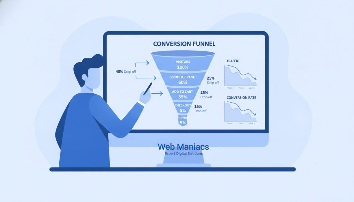
The Conversion Funnel: Where Visitors Drop Off
Understanding your conversion funnel is the foundation of any fix. Your funnel starts when someone lands on your site and ends when they complete a desired action: purchase, sign up, request a demo, or fill out a form. The problem is that visitors drop off at predictable points, and most business owners never measure where.
A typical funnel might look like this: 100 visitors land on your homepage, 40 click through to a product page, 12 add something to a cart, and 3 complete a purchase. That 3% conversion rate is low. But which stage is the real problem? Without data, you’re guessing.
The most common drop-off points are:
- Landing page to product page: Visitors don’t see why they should explore further. Your value proposition isn’t clear.
- Product page to add-to-cart: Features are listed, but benefits aren’t. Visitors don’t understand what problem your product solves.
- Cart to checkout: Shipping costs surprise them, trust signals are missing, or the checkout process feels clunky.
- Post-click behavior: Visitors spend 3 seconds on a page and leave without reading or scrolling.
To diagnose your specific problem, you need traffic data (how many people reach each stage) and behavioral data (what they’re doing on the page, where they click, how far they scroll).
1. Poor Website Speed and Performance Kills Conversions
Your website’s load time is one of the most underestimated conversion killers. Every additional second of load time costs you money. Research from Google’s Web Vitals research shows that pages taking longer than 3 seconds to load see significantly higher bounce rates. Your visitors are comparing you to Amazon and Netflix. If your site feels sluggish, they’ll leave before seeing your value proposition.
The speed problem compounds on mobile. A page that loads in 2 seconds on desktop might take 6 seconds on mobile, and mobile is where most of your traffic comes from.
Common speed culprits include unoptimized images, too many third-party scripts, poor server response time, render-blocking resources, and lack of caching.
To fix this, start with a speed audit using Google PageSpeed Insights. Prioritize image optimization first, it’s often the fastest win. Then address server response time and caching.
Use a Content Delivery Network (CDN) to serve images and static files from servers closer to your visitors. This single change can cut load times by 30-50% for geographically distributed audiences.
2. Weak Value Proposition and Unclear Messaging
Your value proposition is the answer to a visitor’s first question: "Why should I care?" If your homepage doesn’t answer this clearly within 3 seconds, you’ve lost them.
A weak value proposition sounds generic. Phrases like "innovative solutions" or "we deliver results" tell visitors nothing specific. The best value propositions are specific and benefit-focused. Instead of "We provide digital marketing services," try "We increase qualified leads by 40% in 90 days for B2B SaaS companies." The second version names a specific outcome, timeframe, and audience.
Unclear messaging also happens when you try to appeal to everyone. Your homepage should focus on your primary audience and their main problem, not pitch ten different products or services.
Common messaging mistakes include feature-focused instead of benefit-focused copy, jargon and technical language, no clear target audience, weak headlines, and too much text above the fold.
To fix this, audit your homepage messaging. Ask someone unfamiliar with your business to read your headline and first paragraph, then explain what you do. If they can’t articulate it back to you, your messaging is too vague.
Your value proposition should answer three questions in under 50 words: What do you do? Who is it for? What outcome do they get?
3. Missing or Ineffective Calls to Action
A call to action (CTA) is the bridge between interest and conversion. Without a clear CTA, visitors don’t know what to do next, so they leave.
Many websites have weak or buried CTAs. They’re small buttons at the bottom of pages, use vague text like "Click here," or appear only once. Effective CTAs are prominent, specific, and repeated strategically throughout the page.
Your CTA should tell visitors exactly what happens next. Instead of "Submit," use "Get your free quote," "Start your 14-day trial," or "Schedule a demo." Specific CTAs convert 30-50% better than generic ones because they set clear expectations.
Visitors should encounter your primary CTA above the fold, visible without scrolling. But they should also see secondary CTAs throughout the page as they scroll, giving multiple opportunities to convert.
Test different CTA text, colors, and placements. Even small changes, button color from gray to green, or text from "Learn more" to "See how it works", can lift conversion rates by 10-20%.
A missing or weak CTA is often the easiest problem to fix and the highest-impact. Many websites see 15-25% conversion improvements just by adding a clear, prominent CTA above the fold.
4. Poor Mobile Responsiveness and User Experience
Mobile traffic dominates. If your site doesn’t work well on phones and tablets, you’re losing the majority of your potential conversions.
Poor mobile responsiveness means buttons are too small to tap, text is unreadable without zooming, forms require excessive scrolling, or images don’t display properly. Mobile users are on the go and have less patience. Your mobile experience should be simplified and fast.
Common mobile UX problems include non-responsive design, slow mobile load times, tiny tap targets, unreadable text, sticky headers and pop-ups, horizontal scrolling, and desktop-optimized forms.
Test your site on actual mobile devices, not just browser emulation. Use Google Mobile-Friendly Test to identify issues. Prioritize the most common problems: speed, button size, and form simplification.
5. Lack of Trust Signals and Social Proof
Visitors don’t know you. They’re evaluating whether to trust you with their email, money, or time. Without trust signals, they assume the worst and leave.
Trust signals include customer testimonials, case studies, security badges, certifications, media mentions, and user reviews. The most effective trust signals are specific and recent. "We helped Acme Corp increase revenue by 23% in 6 months" is specific and credible. A testimonial from "Sarah Chen, VP of Marketing at TechCorp" with a photo and specific result is powerful.
Add 2-3 customer testimonials with photos and attribution above the fold. Include a case study with specific metrics. Display any relevant certifications or security badges. Update these regularly to keep them fresh.
Video testimonials convert 20-30% better than text testimonials because they feel more authentic. A 60-90 second customer video costs little to produce and dramatically increases credibility.
6. Attracting the Wrong Target Audience
High traffic with low conversions often means you’re attracting the wrong visitors. Your marketing is bringing in people who aren’t a good fit for your product or service.
This happens when your ad copy, keywords, or messaging appeal to a broad audience instead of your ideal customer. If you sell enterprise software at $10,000/month, attracting freelancers and small businesses through cheap ads is wasteful.
The fix starts with understanding your ideal customer profile. Who has the most to gain from your product? What problem do they have? What keywords do they search for? Once you have this clear picture, you can adjust your marketing to attract these people specifically.
Audit your traffic sources. Use Google Analytics to understand visitor behavior by source. Which sources bring visitors who convert? Double down on the former, reduce or eliminate the latter.
Website Conversion Rate Optimization Best Practices
Conversion rate optimization (CRO) is the discipline of systematically improving your website’s conversion rate through testing, measuring, and iterating based on data.
The CRO process starts with understanding your baseline. What’s your current conversion rate? Where are visitors dropping off? Once you have this diagnostic data, you can prioritize the highest-impact changes.
The best CRO teams focus on one thing at a time. They identify a hypothesis, test it, measure the results, and implement the winner. This disciplined approach beats random redesigns.
Common CRO best practices include testing one variable at a time, running tests long enough for statistical significance (at least 100-200 conversions per variation), prioritizing high-traffic pages, focusing on friction points, testing big changes first, and documenting everything.
A/B Testing and Post-Click Behavior Analysis
A/B testing is the most reliable way to improve conversions. You show version A to some visitors and version B to others, then measure which converts better. The winner becomes your new baseline, and you test again.
The key to successful A/B testing is understanding post-click behavior. Where do visitors click? How far do they scroll? How long do they stay? This behavioral data reveals what’s working and what isn’t.
Post-click behavior analysis uses tools like heatmaps and session recordings to visualize what visitors do. You can see exactly where they click, which sections they read, where they get stuck, and where they exit.
Start with high-impact tests. Test your headline, main CTA, form fields, and page layout. These changes typically move conversion rates more than color tweaks.
A/B testing reveals what actually works instead of what you think works. Even small improvements, 2-3% per test, compound over time into 20-30% conversion rate increases.
Using Heatmaps and User Behavior Data
Heatmaps show you exactly where visitors click, scroll, and spend time on your pages. A red area means lots of clicks or attention. A blue area means visitors ignore it. This visual data is invaluable for understanding user behavior.
Session recordings take heatmaps further by showing you actual visitor sessions. You watch as real people navigate your site, click buttons, fill out forms, and decide whether to convert. This qualitative data reveals pain points that numbers alone can’t.
For example, a heatmap might show that visitors click on a product image, expecting it to be a link. A session recording would show them getting frustrated when nothing happens. That’s a fixable problem.
| CRO Tool | Primary Function | Best For |
|---|---|---|
| A/B Testing | Compare two page variations | Testing headlines, CTAs, layouts |
| Heatmaps | Visualize clicks and scrolling | Understanding where visitors engage |
| Session Recordings | Watch actual visitor sessions | Identifying friction and confusion |
| Form Analytics | Track form field abandonment | Simplifying multi-step forms |
| Analytics | Measure traffic and conversions | Understanding drop-off points |
Use heatmaps to identify your biggest UX problems. Are visitors clicking on elements that aren’t clickable? Are they ignoring your main CTA? Are they not scrolling far enough to see important content?
The reason your website isn’t converting visitors likely isn’t mysterious. It’s one or more of these fixable problems: slow load times, unclear messaging, weak CTAs, poor mobile experience, missing trust signals, or attracting the wrong audience. The path forward is diagnostic, not guesswork. Measure where visitors drop off, test solutions, and iterate based on data.
Web Maniacs specializes in exactly this kind of conversion optimization. Our team combines custom website design, strategic messaging, and data-driven testing to help businesses increase conversions. We’ll audit your current site, identify the real bottlenecks, and implement fixes that move the needle. Get started today and transform your website from a traffic sink into a conversion engine.
Frequently Asked Questions
What is a good conversion rate for a business website?
Conversion rates vary significantly by industry, but a general benchmark is 2-5% for most websites. However, the real metric that matters is YOUR conversion rate trend. If your rate is declining or flat despite traffic growth, you have a conversion problem. Use analytics tools to track your specific conversion rate, then focus on improving it through CRO testing and user experience optimization rather than comparing to industry averages.
How do I identify why my website has high traffic but no sales?
High traffic with low conversions indicates a mismatch between visitor intent and your landing page experience. Use analytics to track post-click behavior: which pages do visitors land on, how long do they stay, where do they drop off? Analyze your sales funnel to pinpoint the exact friction point. Common causes include poor value proposition clarity, weak calls to action, slow page load speed, or attracting the wrong target audience through your marketing strategy.
How can conversion rate optimization tools help diagnose my website's problems?
CRO tools like heatmaps show exactly where users click and scroll, revealing friction points. Analytics platforms track bounce rate and conversion funnel abandonment. Session recording tools reveal user behavior patterns. Together, these tools provide data-driven insights into whether your problem is technical (speed, mobile responsiveness), messaging (value proposition), trust-related (social proof), or UX-related (navigation, CTA placement). This diagnostic approach beats guessing.
What are the most common reasons for low website conversion?
The top conversion killers are: poor page load speed (users abandon slow sites), unclear messaging that doesn't match visitor intent, missing or weak calls to action, poor mobile optimization, lack of trust signals, and complicated navigation that increases friction. Additionally, attracting the wrong target audience through misaligned marketing means visitors never intended to convert. A proper conversion funnel analysis using analytics and heatmaps reveals which of these is YOUR specific bottleneck.
This article was written using GrandRanker